Quiet-Luxury Color Palettes: A Minimalist Checklist
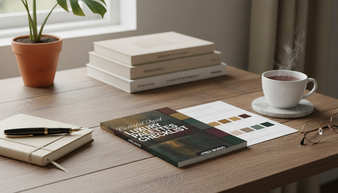
Colorful Quiet Luxury Palettes Checklist: Elegant Color Schemes for Minimalist, Timeless Spaces
Quiet luxury doesn’t have to mean beige-on-beige. With the right balance of muted saturation, refined contrast, and thoughtful materials, color can feel understated, expensive, and enduring. The goal is a palette that looks intentional across walls, textiles, furniture, and decor—without drifting into loud, trendy, or “busy.” Use the checklist below as a simple system you can repeat room to room.
What “Colorful Quiet Luxury” Looks Like
Color reads as “quiet” when saturation is restrained, undertones are consistent, and contrasts are controlled. Instead of bright, high-chroma statements, think complex shades that behave like neutrals: dusty, smoked, softened, and easy to live with through changing seasons.
Luxury cues come from clarity and discipline: fewer colors, better materials, cleaner lines, and repeatable rules. A timeless palette prioritizes undertone harmony (warm vs. cool) over chasing the newest shade family. If you want a useful reference point for naming and identifying colors, the Pantone Color Institute is a helpful starting place.
The Checklist: Build a Palette That Feels Expensive (Not Busy)
1) Choose an anchor neutral (your “canvas”)
Start with a soft, matte-friendly neutral for the largest surfaces: warm ivory, stone greige, soft taupe, fog gray, or gentle clay. Anchor neutrals should feel calm in both daylight and lamplight, because they’ll dominate the visual field.
2) Pick one “quiet color” (your signature)
Choose one muted color that feels sophisticated rather than bright—dusty teal, muted olive, inked navy, smoked aubergine, terracotta blush, or umber-rose. This is the tone that makes the room feel personal, but it should still read “adult” and restrained.
3) Add a deep grounding tone (optional, but powerful)
A small amount of depth can make the whole room feel richer. Use espresso, charcoal, deep marine, or dark olive in compact doses—frames, hardware, a lamp base, or a side table—so it grounds without taking over.
4) Select one metal and one wood tone, then repeat them
Pick a single metal finish (brushed brass, blackened steel, polished nickel) and one wood tone (walnut, oak, ash). Repetition is what makes “minimal” look intentional instead of sparse. Mixing finishes can work, but too many variations often read as visual noise.
5) Set a ratio before shopping
Decide the balance upfront so your cart doesn’t become a patchwork: 70–80% anchor neutral, 15–25% quiet color, 5–10% deep tone. This one rule prevents the most common “why does this feel chaotic?” result.
6) Confirm undertones in consistent lighting
Undertone shifts are the most common reason palettes feel “off.” View samples morning and evening in the same spot. If you’re also choosing art or textiles online, keep basic contrast readability in mind—especially for dark-on-light pairings—using guidance like the W3C WCAG contrast recommendations.
7) Repeat the signature color at least three times
One throw pillow in the “special color” looks accidental. Repeat the signature tone across at least three touchpoints—textile, art, and an accessory—so it reads deliberate and designed.
| Role | Percent of Room | Where It Works Best |
|---|---|---|
| Anchor neutral | 70–80% | Walls, large rugs, core upholstery, curtains |
| Quiet color | 15–25% | Accent chair, pillows, bedding, painted built-ins, art |
| Deep grounding tone | 5–10% | Frames, lighting, hardware, small tables, trim accents |
Elegant Color Families That Stay Timeless
When you want color without constant re-styling, start with a “family” and stay disciplined about undertones.
- Soft earth + refined contrast: stone, clay, tobacco, and ink—warm and architectural.
- Coastal restraint: sand, fog, muted marine, and driftwood—relaxed without feeling themed.
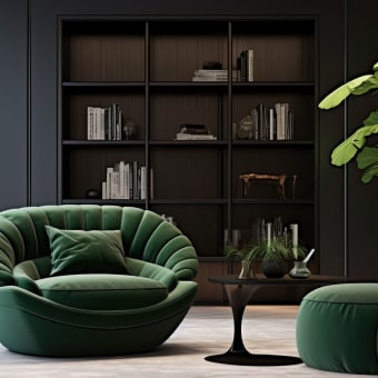
- Garden neutral: oat, muted olive, parchment, and dark bronze—organic and calm.
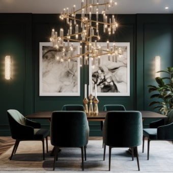
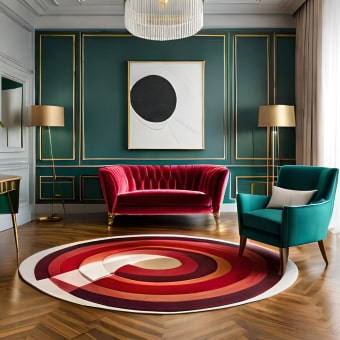
- Modern jewel understatement: warm ivory, smoky emerald, espresso, and brushed brass—rich but controlled.
- Minimalist monochrome with a twist: layered grays with one dusty color (mauve-gray or blue-gray) to prevent flatness.
Material Pairings That Make Color Look More Luxurious
In quiet luxury, the “expensive” feeling often comes from finish and texture more than hue.
Room-by-Room Palette Application (So It Feels Cohesive)
Living room
Bedroom
Kitchen
Bath
Whole-home flow
Common Mistakes That Break the Quiet-Luxury Effect
Use the Downloadable Checklist to Plan Fast (Before Buying Anything)
- Colorful Quiet Luxury Palettes Checklist (digital download) for quick planning before paint and decor orders.
- Choose a hero seating piece that stays neutral while letting texture shine, like the Nordic Rattan Leisure Single Sofa Chair – Solid Wood, Modern Fabric Design.
- Use lighting as a controlled “sparkle” element—especially effective with muted palettes—such as the Elegant Art Deco-Inspired Crystal Branch Chandelier for Dining Room.
FAQ
How can a minimalist room use color without looking busy?
Use one anchor neutral for large surfaces, one muted signature color repeated three or more times, and (optionally) one deep tone in small details. Keep patterns low-contrast and rely on texture—linen, wool, rattan, stone—to add interest without adding extra hues.
What’s the easiest way to tell if two colors have clashing undertones?
Compare both colors against a clean white sheet in the same lighting and look for shared warmth or coolness. If one reads rosy/yellow while the other reads blue/green, add a bridge shade between them or swap one color to match the dominant undertone.
Does quiet luxury require neutrals only?
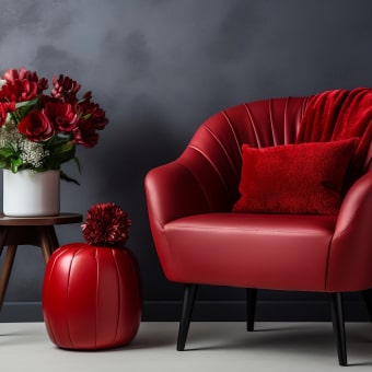
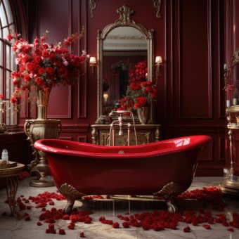
No—quiet luxury comes from controlled saturation, consistent undertones, and high-quality finishes. Dusty blues, muted olives, and smoky reds can feel just as refined as beige when applied in disciplined ratios with matte or textured materials.










Leave a comment