Quiet Luxury Minimalism: Neutral, Timeless Interiors
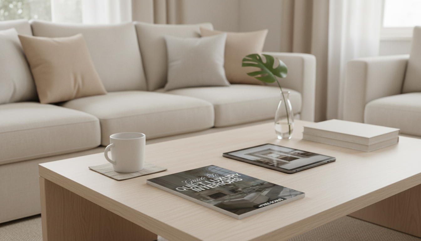
Quiet Luxury, Minimalist Living: A Practical Guide to Neutral, Timeless Interiors
Quiet luxury interiors balance restraint with richness—clean lines, thoughtful negative space, and materials that look better with time. The goal isn’t to strip a home bare; it’s to make every choice feel intentional. With a calm neutral palette, fewer-but-better furnishings, and subtle texture layering, even everyday rooms can feel serene, elevated, and easy to live in. For more guidance, see Interior Architecture and Design: Professional Associations.
What “Quiet Luxury” Looks Like in a Minimalist Home
Quiet luxury shows up as calm confidence: a space that feels composed, not crowded. Instead of relying on lots of décor, the room’s craftsmanship, proportions, and finishes do the heavy lifting. For further reading, see Center for Community-Engaged Design – Interior Architecture.
- Uncluttered backdrops: Clear surfaces and breathing room let quality materials stand out.
- Simple silhouettes, elevated details: Look for refined seams, soft curves, concealed storage, and lighting that feels planned rather than added later.
- Sensory comfort: Matte finishes, natural fibers, and sound-softening textiles create a quieter feel.
- Clear visual hierarchy: One or two focal points—art, a sculptural chair, or a statement light—supported by quieter supporting pieces.
For more inspiration on how designers use proportion and restraint, browse editorial room tours at Architectural Digest and Elle Decor.
Build a Neutral Palette That Never Feels Flat
A timeless neutral palette doesn’t mean “all one color.” It means controlling undertones and building contrast through light, mid, and deep values—then repeating those choices throughout the home for a quiet rhythm.
- Start with three capsule neutrals: a warm off-white, a mid-tone greige/taupe, and a grounding deep neutral (charcoal, deep brown, or ink).
- Balance undertones: keep warm-with-warm or cool-with-cool across walls, upholstery, and rugs so rooms flow naturally.
- Use contrast in value, not color: light walls + mid-tone textiles + darker accents prevents a washed-out look.
- Repeat key tones: the same wood tone and metal finish across multiple rooms reads “designed,” not piecemeal.
- Use true black and high-gloss sparingly: small, deliberate moments (frames, hardware, a lamp base) keep the overall mood soft.
Neutral Palette Builder (Capsule Approach)
| Layer | Role | Examples | Where to Use |
|---|---|---|---|
| Base | Airy backdrop | Warm white, soft ivory | Walls, ceiling, large curtains |
| Middle | Body and warmth | Greige, mushroom, stone | Sofas, rugs, bedding |
| Anchor | Depth and definition | Charcoal, espresso, deep olive-neutral | Accent chairs, side tables, trim moments |
| Texture | Visual interest | Linen, wool, boucle, rattan, oak | Pillows, throws, shades, baskets |
If you’re choosing paint, it helps to compare undertones in real light. The color tools at Sherwin-Williams Color Inspiration can help narrow down warm vs. cool neutrals.
Materials and Finishes That Signal Timeless Quality
Quiet luxury leans on materials that feel grounded and age gracefully. The more minimal the room, the more noticeable finish choices become.
- Prioritize natural materials: solid wood (or quality veneers), stone, linen, wool, leather, ceramic.
- Matte or satin over shine: soft finishes read calmer and often look more expensive; reserve gloss for tiny accents.
- Limit metals: choose one main finish plus a quiet secondary (example: brushed brass + aged nickel) to avoid visual noise.
- Choose patina-friendly surfaces: oak, walnut, unlacquered brass, and textured stone often look better over time.
- Keep patterns tonal and scaled: if you use pattern, aim for subtle grids or tone-on-tone stripes rather than trend-heavy prints.
Furniture: Fewer Pieces, Better Proportions
Minimalist rooms feel “quiet” when the furniture is edited and sized correctly. Proportion is the shortcut to a space that looks intentional—especially in neutrals.
- Edit to essentials: start with anchor pieces (sofa, bed, dining table), then add only what improves function.
- Favor calm silhouettes: low, longer profiles often read more relaxed; keep visual weight consistent.
- Mix one hero with quiet supports: a sculptural chair can be the focal point if the rest of the room stays restrained.
- Conceal the everyday: closed cabinets, credenzas, and lidded baskets protect the minimalist feel.
- Leave breathing room: visible floor space and clear walkways instantly elevate modest rooms.
If you want a single sculptural accent that still feels natural and grounded, consider the Nordic Rattan Leisure Single Sofa Chair – Solid Wood, Modern Fabric Design as a “hero” piece in a reading corner—paired with a simple side table and a textured throw.
Lighting That Feels Architectural (Not Decorative Clutter)
Lighting is one of the most convincing quiet-luxury upgrades because it changes how finishes, textures, and even wall color read. The goal is depth without fuss.
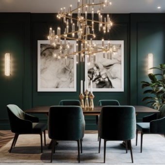
In a dining room, one statement fixture can act as the centerpiece while the rest of the décor stays minimal. The Elegant Art Deco-Inspired Crystal Branch Chandelier for Dining Room can serve as that focal point—especially when paired with a simple table, tonal linens, and understated place settings.
A Room-by-Room Checklist for Quiet Luxury Results
A Simple Starting Point: eBook + Checklist to Keep Decisions Consistent
For a structured approach, the Guide to Quiet Luxury Interiors | Minimalist Home Design eBook | Neutral Palette, Timeless Style & Interior Design Checklist is designed to help keep choices cohesive from room to room.
FAQ
What makes a home feel “quiet luxury” instead of just plain minimal?
Quiet luxury comes from upgrading fundamentals—materials, proportions, lighting, and texture—while keeping décor restrained. The negative space feels intentional because the remaining pieces are high-quality and well-placed.
How can neutrals look warm and inviting rather than cold?
Choose warm undertones, add natural textures like linen, wool, and wood, and build contrast with light/mid/dark values. Warm, dimmable lighting also softens neutrals and makes the room feel welcoming at night.
What are the easiest upgrades to get a timeless look fast?
Refresh walls with a consistent neutral, size up your rug, and hang lined curtains for a cleaner drape. Then unify hardware/metal finishes and improve lighting with layered sources and dimmers.











Leave a comment